
Welcome to Modern Net Solutions! We're here to help you build a smarter website. No matter where you are in the process, from beginning to end and everything in between, we are here to build your dream.
Follow us:


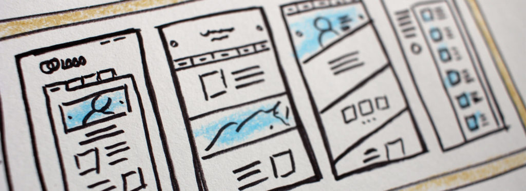
The layout of your website can seriously impact your conversion rates. According to research, less is more! Many companies have found that by removing unnecessary elements from their landing pages, they increased their conversion rates.
Consider what information your customers are really looking for. Better yet, ask them! You might be surprised when you ask previous clients about what they found engaging or confusing on your site. Use this information to streamline your website.
When planning your layout, you should also keep in mind your end goal. The conversion! While you may want to include educational information or other details, remain focused on how you will move visitors to that end goal.
While you certainly want to make your site accessible so customers can find the pages they need, research has shown that most navigation bars aren’t necessary. One company found that by removing the sidebar from their blog, the website’s conversion rate increased by 71%.
Carefully evaluate exactly where you need navigation, and be sure not to offer too many directions to users. You don’t want to pull the user away from your landing page before you can convert them to a paying customer.
Humans are creatures of habit, which makes us predictable. Luckily, that also means there is tons of research out there on what impacts human behavior. Color theory is a time-tested trove of information.
For example, research has shown that the color red triggers a feeling of urgency. Therefore, many sites use red buttons to draw attention. One recent study from Hubspot found that using red call-to-action buttons increased their conversion rate by 21%.
While you don’t always need to use the color red to make your point, you should at least ensure that you choose colors that will pop and provide good contrast with the rest of your site. For secondary calls-to-action, try using less catchy colors.
The colors you use on your site should also relate to your brand. If your site doesn’t remind visitors of your brand, they may not make a connection and return to your site for future purchases.

Take special care when selecting visuals for your website. You will want to avoid overused stock photos and instead focus your energy on finding images that can establish trust and engagement.
Happy customers make purchases. And how do you make people feel happy? By showing them images of upbeat people! One company found that adding a picture of a happy woman to their site increased their conversions by 102%.
You can also build trust by including security badges on your site. Many users are leery of online purchases because of security risks. Show them that your site is safe.
Users want to see what they’ll be getting if they make a purchase. If you sell goods, it is vital that your site include clear photos of your products. And even many services can be understood through visual cues. Leverage clear photography or even short videos or GIFs to help users understand what you’re offering them.
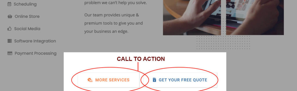
Every business website needs a clear call to action. This could be in the form of a large clickable icon, or perhaps a button that shows up on specific pages, pop-ups, etc. When it comes to pop-ups, be aware that many browsers block these.
Call-to-action buttons push the user to get in touch with you, buy your product, or get involved in some other way that you’ve determined is helpful to your business model.
In terms of website design, if your call to action is not always visible, you risk losing the user to distraction or competition. That’s why your website design must involve careful consideration for how you will entice the user to act and to do so quickly.
Whatever your business or marketing strategy, your website will always be at the heart. Take your time to do your research, learn your target audience, and optimize your web design around the factors that will work best for your business.
And if you aren’t a web design whiz, it is always best to hire a professional. So much of your business rides on your web presence, and you want your site to remain updated and in top form.
Let the pros at Modern Net Solutions design and optimize your website. We make beautiful websites complete with easy-to-use interfaces and modern amenities built to drive traffic and increase customer conversion rates. With Modern Net Solutions, “Design Meets Functionality.” Reach out today for a free quote and get started on building your dream website.

